

The 1968 Portfolio
What the last great inflation regime can teach you about the next two decades — and why most investors are positioned for a world that no longer exists

This essay draws on conversations and analysis from Jen Skovdal (Goldcorp TV), Adam Rosenwag (Garing & Rosenwag), Gareth Soloway (Verified Investing), and Larry McDonald (The Bear Traps Report). Their frameworks have shaped the argument throughout and are acknowledged with gratitude. Nothing in this essay constitutes financial advice.
The Wrong Clock
Every morning I watch the same thing happen.
IGLG, my iShares physical gold ETC opens, and within the first hour it drops. Not dramatically. Not in a way that would alarm anyone who wasn’t paying attention. Just a quiet, steady bleed of one, sometimes two percent. Then, sometime after lunch, it begins to recover. By the afternoon close it has often regained everything it lost, and occasionally a little more.
For weeks I watched this pattern repeat and asked myself the obvious question. Is something wrong with gold? Is the market telling me something I am missing? Is sterling moving in a way that is quietly undermining my position?
The answer, as it turned out, was structural and entirely mechanical. The GBP hedge in IGLG resets daily using the prior day’s closing exchange rate. If sterling has moved overnight as it frequently has in recent months, the ETC is briefly mis-hedged at the London open, creating a small but visible drag on the sterling price that resolves through the day. The LBMA’s morning gold fix brings concentrated commercial selling pressure into the early session. And New York institutional money, broadly bullish on gold for reasons I will come to, provides the afternoon bid that lifts prices back. The morning dip is not a signal. It is plumbing. It is arithmetic. It tells you nothing about the direction of gold over the next decade.
But here is what stayed with me after I understood the mechanics. I had been asking the wrong question. I had been watching the clock on the wall when I should have been reading the calendar on the desk.
This is, I have come to believe, the central error most investors are making right now. Not just with gold. With everything.
We are living through one of those rare moments in financial history when the entire frame of reference shifts. When the rules that governed the previous era quietly stop applying, and the rules of a new era begin. Slowly, then all at once. These transitions are almost never obvious in real time. They are only obvious in retrospect, when historians can draw the clean line and say: there. That is where the old world ended and the new one began.
The last time this happened at scale, the year was 1968.
Lyndon Johnson’s Great Society was in full spending mode. Medicare, Medicaid, anti-poverty programmes, education spending. All of it financed not by taxation but by debt and monetary expansion, while simultaneously funding a ground war in Vietnam that was consuming billions with no end in sight. The Bretton Woods system, which had anchored the global economy since 1944 by fixing the dollar to gold at $35 an ounce, was quietly breaking under the strain. Too many dollars had been printed. Too little gold remained to back them. France, ever alert to American financial sleight of hand, was already sending ships to New York to redeem its dollar reserves for physical bullion.
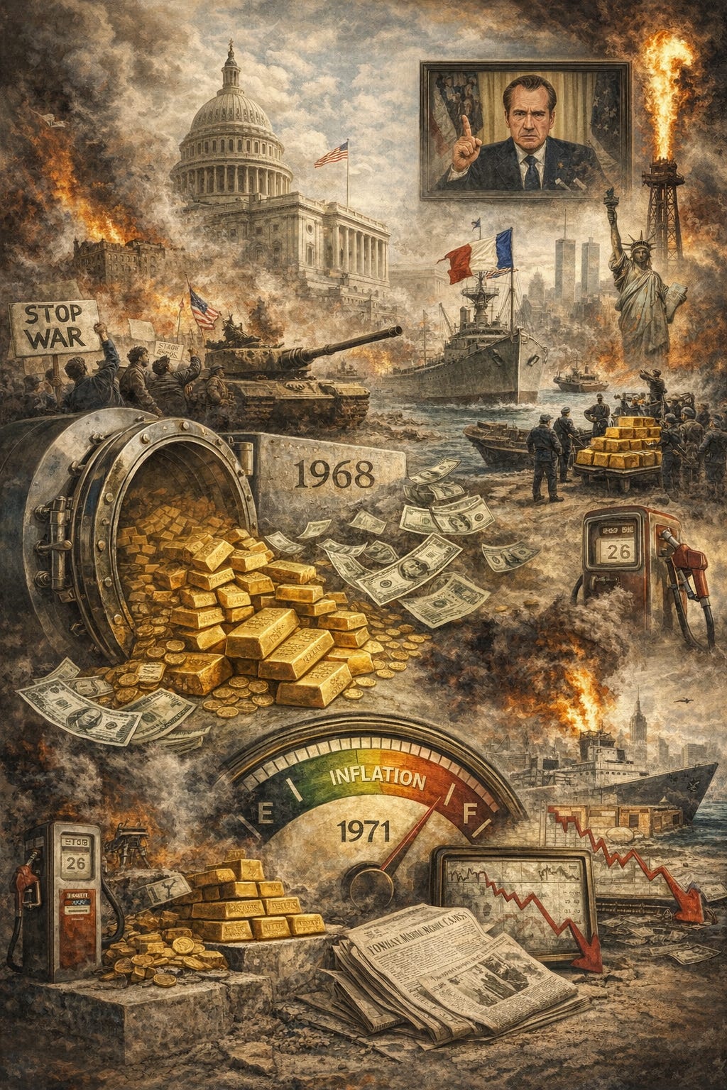
In August 1971, Nixon closed the gold window. The dollar was cut loose from gold entirely, becoming a fiat currency backed by nothing but faith in the United States government. The last link between money and something real was severed. What followed was thirteen years of monetary disorder: inflation that rose from 1.4% in 1960 to 13.5% by 1980, two catastrophic oil shocks, a stock market that lost nearly half its real value over the decade, and bond markets that were quietly destroyed as yields climbed from 6% to over 15%.
The investors who navigated that period well were not the ones who reacted to every headline. They were not the ones watching their portfolios tick up and down on a daily basis and adjusting accordingly. They were the ones who had understood, early enough, that the regime had changed. That the portfolio which had served them through the postwar boom. Heavy in financial assets, light in real ones. Now precisely the wrong portfolio for the world they were actually living in.
The investors who did not understand this held on to their growth stocks and their long bonds and watched inflation eat them quietly, year after year, until by 1980 the Dow Jones had gone nowhere in nominal terms for a decade and absolutely nowhere in real ones.
I think about that investor often. Not as a historical curiosity. As a warning.
Because right now, today, the average investor’s portfolio looks remarkably similar to the one that failed between 1968 and 1981. It is built around financial assets. Technology stocks, growth equities, long-duration bonds. In a world where those assets are priced for a low-inflation, low-interest-rate, US-dominated, unipolar future. A world, in other words, that may already be behind us.
Energy, materials, and industrials make up just 14% of the S&P 500 today. In the early 1980s, at the peak of the commodity supercycle, they made up close to 50%. That gap is not a curiosity. It is the setup.
This essay is an attempt to understand it. Not to predict the future. No one can. But ask the question that I think deserves more serious attention than it is currently receiving: if we are in the early stages of a regime change comparable to 1968, what does a sensible portfolio look like for the next twenty years? And how different is it from the one most of us are currently holding?
The answer, I suspect, will be uncomfortable. Let us get into it.
The Largest Shock the Oil Market Has Ever Seen
Most people, when they think about the oil price, think about the number on the pump. They think about what it costs to fill the car, or what the headline says when Brent crude moves above a round number. They do not think about what happens when the oil stops moving altogether.
That is what is happening now.
The Strait of Hormuz is a narrow channel of water. At its tightest, just twenty-one miles wide. This sits between Iran and the Arabian Peninsula.

Through it passes somewhere between ten and fifteen million barrels of crude oil every single day. Saudi crude bound for Asia. Emirati oil heading to European refineries. Qatari liquefied natural gas destined for power stations in Japan, South Korea, Germany. The strait is not just a shipping lane. It is the circulatory system of the global industrial economy. And right now, it is closed.
The International Energy Agency has confirmed that global oil output fell by approximately eight million barrels a day in March. To put that in context: the two OPEC oil embargoes of the 1970s (the events that defined a decade of inflation and economic misery for the Western world) disrupted supply by a fraction of this magnitude. The COVID demand collapse of April 2020, when oil briefly went negative, was a demand shock, not a supply one. Nothing in the recorded history of the global oil market compares to what is currently unfolding in the Strait of Hormuz.
Adam Rosenwag, managing partner at Garing and Rosenwag, put it plainly in a recent conversation: somewhere in the order of 230 million barrels of oil have already been impacted since the closure began. And the strait remains shut as this is written. When it does reopen. And it will. Those barrels will not be retroactively produced. They simply will not exist.
The IEA’s coordinated release of 400 million barrels from member nations’ strategic petroleum reserves sounds substantial. It is less so when you understand the plumbing. The realistic maximum flow rate from the combined OECD reserves is somewhere around four million barrels a day. Against a daily shortfall of ten to fifteen million barrels, that leaves an enormous hole. Every single day.
The Second-Order Effects Nobody Is Talking About
The Strait of Hormuz does not just carry oil. It carries the raw material inputs for the entire real economy. Urea fertiliser. The nitrogen base for a significant portion of global crop production passes through the strait. Phosphates, another critical agricultural input, pass through the strait. Sulphur, aluminium, liquefied natural gas, petrochemical feedstocks. All of it moves through that twenty-one-mile channel.
The disruption to these flows is already registering. Urea fertiliser prices have risen approximately 28% since the closure began. Diesel has crossed $5 a gallon just as American farmers are entering planting and seeding season. Larry McDonald, founder of the Bear Traps Report, framed the second-order effects precisely: the disruption to supply chain trust across the Gulf region will take sixty to ninety days to begin normalising even after the physical flows resume.
Bunkering fuel. The heavy fuel oil that powers cargo vessels is becoming scarce in key Asian ports. If bunkering fuel becomes broadly unavailable, the secondary disruption to global trade could rival the supply chain seizure of the COVID era. That disruption was inflationary for the better part of three years.
The oil shock is the headline. The food inflation shock, the fertiliser shock, the shipping disruption. These are the second chapter. They are arriving now. Most people have not yet noticed them at the supermarket till.
The Hidden Fire
There is a particular kind of danger that arrives not with a bang but with a series of small, seemingly unconnected events that nobody is paid to join together.
In 2007, oil was rising. The headlines were about oil. Meanwhile, in the unglamorous back offices of mid-tier American mortgage lenders, something else entirely was beginning to come apart. Nobody was talking about it. Everyone was watching oil. By September 2008, Lehman Brothers was gone.
I do not think we are in 2008. The structural differences are real. But I do think we are in a moment that rhymes with the eighteen months before 2008 in one very specific and very important way: the thing most people are watching is not the thing most likely to break the system.
Everyone is watching the oil price. The real risk is in private credit.
To understand why, you need to understand how large this market has become and who is sitting inside it without knowing it.
The global private credit market reached $3.5 trillion in assets under management by the end of 2024, up 17% from the end of 2023. At the start of 2025 it stood at $3 trillion, compared to roughly $2 trillion in 2020, and is estimated to grow to approximately $5 trillion by 2029. To put those numbers in context: the entire US subprime mortgage market at the peak of the 2008 crisis was approximately $1.3 trillion. Private credit is already more than twice that size, growing faster, and significantly less transparent.
Private credit firms can report the value of their loans according to their own internal models, rather than the market price. Marking to model instead of marking to market. It is nearly impossible to verify that the loans are worth what they are claimed to be.
Now consider who is holding this $3.5 trillion. It is not a small circle of sophisticated hedge funds. Large institutional investors such as pension funds and insurance companies hold substantial exposure. Nearly half of the increase in average Level 3 assets among selected pension funds, representing 17.5% of global pension assets, is linked to growing allocations to private credit since 2016. Private credit now accounts for about 35% of the investment portfolios of North American insurance companies. Your pension. Your annuity. Your life insurance policy. These are the vehicles through which ordinary people have been quietly and unknowingly allocated to the riskiest corner of an unregulated shadow banking system that is now under strain.
Jeffrey Gundlach, the billionaire bond investor, has predicted that the next financial crisis will come from private credit. Jamie Dimon warned that when you see one cockroach, there are probably more.
The oil shock is tightening financial conditions. Tightening financial conditions are stressing private credit borrowers. Stressed borrowers are triggering redemption gates. Redemption gates are forcing institutions to sell liquid assets. Selling liquid assets depresses public equity markets. Depressed markets reduce consumer wealth and spending. Reduced spending deepens the recession that was already forming before the first missile was fired.
Each step in that chain is already under way. We are not predicting a catastrophe. We are describing a transmission mechanism that is operating in real time, largely out of sight, while everyone watches the oil price.
The oil shock is the fire everyone can see. Private credit is the fire in the engine.
Gold’s Two Clocks
Let me start with the question everyone is asking. If the world is coming apart at the seams. A war closing the most strategically important waterway on earth, a private credit market of $3.5 trillion under quiet but accelerating stress, a financial system running on debt that it cannot plausibly repay. Then why is gold not at $8,000 an ounce?
The answer is both more instructive and more interesting than either the bulls or the bears typically acknowledge.
Gold runs two clocks simultaneously. They are set to completely different time zones. And the single greatest source of confusion among investors is the habit of checking the wrong one.
The short-term clock measures sentiment, positioning, leverage, and liquidity. It responds to margin calls, to momentum reversals, to the behaviour of fast money that entered the trade for the wrong reasons and will exit it just as quickly. The long-term clock measures something entirely different. It measures the accumulating weight of monetary debasement, fiscal recklessness, geopolitical fragmentation, and the gradual erosion of institutional trust.
The Short-Term Case: The Flush Before the Run
Gareth Soloway, one of the more rigorous technical analysts operating in the precious metals space, has made what he freely acknowledges is an uncomfortable call. He expects gold to pull back to approximately $3,500 an ounce by year end. He holds this view not because he is bearish on gold’s long-term fundamentals, but because he is honest about what the short-term chart is telling him.
His argument: the final surge in gold’s price had the hallmarks of momentum-driven, emotionally-fuelled buying. When financial conditions tighten and a credit event forces deleveraging, fear does not discriminate. Gold, as one of the most liquid assets an investor holds, gets sold first. We saw this in March 2020. Gold fell sharply. Not because its fundamentals had deteriorated, but because it was liquid and everything else was not. It recovered within weeks and went on to new highs.
Soloway’s response to the bullish structural arguments is characteristically direct: he agrees with them entirely. What he disputes is the assumption that institutional money is immune to fear in a genuine deleveraging event. Both positions can be simultaneously correct. That is the point.
The Long-Term Case: $10,000 and the Paper Coverage Argument
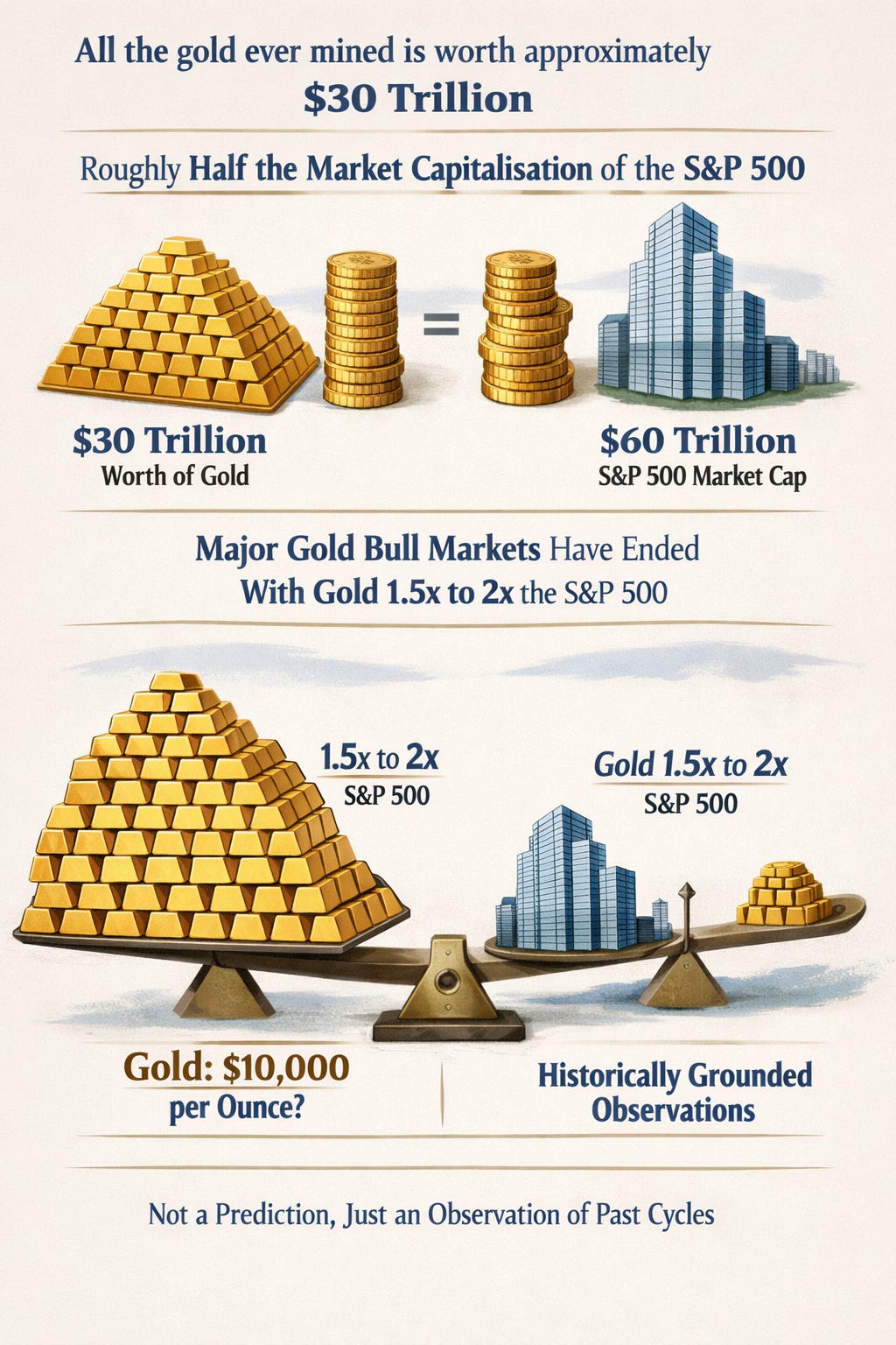
Adam Rosenwag offers the most intellectually rigorous framework for understanding where gold goes over the next decade. All the gold ever mined in human history is worth approximately $30 trillion at current prices. Roughly half the market capitalisation of the S&P 500. Historically, major gold bull markets have ended with gold’s total value somewhere between one and a half and two times the S&P 500. On a flat S&P, that implies a gold price of around $10,000 per ounce.
The second data point is the coverage ratio. At current prices, every US dollar in circulation is backed by approximately 25 cents worth of gold in US reserves. Historically, gold bull markets have ended when that coverage ratio reaches or exceeds 100%. Getting from 25 cents to full coverage requires roughly a fourfold increase in the gold price. Taking you, from approximately current levels, to somewhere north of $10,000.
Larry McDonald adds the policy dimension that gives the long-term gold case its most uncomfortable edge. With $38 trillion in US government debt growing by approximately $2 trillion a year, the only realistic exit from this debt trap is to allow inflation to run persistently above the real return on government debt. Gradually eroding the real value of the liability. This is financial repression. Gold is the asset that financial repression cannot touch. It has no coupon to inflate away. It has no maturity date. It is nobody’s liability.
The short-term clock may be flashing caution. The long-term clock is pointing somewhere most investors are not yet looking.
What the Last Great Inflation Regime Can Teach Us
In the summer of 1968, the average American investor had no particular reason to worry. The postwar economic boom had delivered two decades of extraordinary prosperity. The conventional investment portfolio had performed brilliantly for a generation. There was no obvious reason to question a portfolio heavy in equities, supported by bonds, denominated in dollars.
What that investor could not see was the slow accumulation of forces that were about to make that portfolio precisely the wrong one for the world they were about to inhabit.
What Actually Happened to Portfolios
The S&P 500, adjusted for inflation, lost nearly half its value over the 1970s. The Dow Jones Industrial Average had a nominal gain of thirty points across an entire decade. An investor who held a balanced 60/40 equity and bond portfolio from 1968 to 1981 and did nothing else would have ended the period with roughly the same nominal wealth and substantially less real wealth.
The bonds were destroyed by rising yields. 10-year Treasury went from 6% in 1970 to over 15% by 1981. The equities were destroyed by valuation compression. The the premium growth stocks of the late 1960s, the Nifty 50 saw their prices cut by 60 to 90% in the 1973-74 bear market alone.
What Worked
Gold rose from approximately $35 in 1970 to approximately $850 at its January 1980 peak. An insignificant gain (😂) of over 2,300%. In real, inflation-adjusted terms, gold delivered approximately 9% annual returns throughout the stagflation period. Nothing else came close.
Broad commodities delivered a total return of approximately 586% across the 1970s. Oil prices rose over 1,000%. Agricultural commodities. Wheat, corn, soybeans more than tripled. Copper and industrial metals posted large gains. Farmland appreciated from $137 per acre in 1970 to $737 per acre by 1980. Real estate delivered approximately 13% nominal annual returns.
Within equities, value stocks outperformed growth stocks significantly. Defensive sectors of consumer staples, healthcare, utilities held up far better than economically sensitive areas. Energy equities were among the best performers in the stock market. The sector that the broader investment community had ignored and underfunded through the 1960s became the dominant return driver of the following decade.
The Translation: What the 1968 Playbook Looks Like Today
The structural similarities between 1968 and now are substantial. Both began with prolonged fiscal excess. Both involved a monetary system under strain from too much debt and too much printed money. Both were characterised by geopolitical fragmentation and the erosion of US dominance. Both featured energy shocks. And both arrived after a long period of capital starvation in real assets.
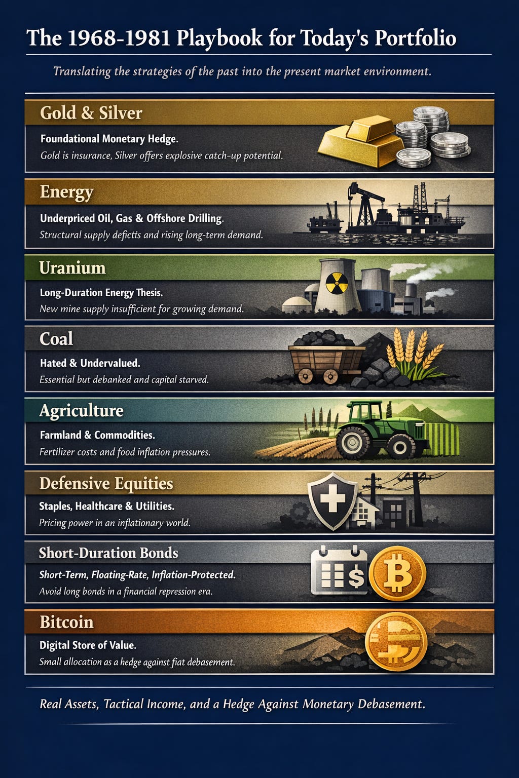
Gold and silver remain the foundational monetary hedge. Gold is not a trade. It is insurance against the long-term consequences of a financial system that has borrowed more than it can repay and will choose inflation over default as its preferred exit route.
Energy is the most direct translation from the 1970s playbook. Oil producers, natural gas companies, and offshore drilling operators are priced for $70-75 oil over the long term. The structural supply deficit that predates the Hormuz closure suggests long-term prices will settle considerably above that level.
Uranium represents the cleanest long-duration energy thesis available to a retail investor. Nuclear power plants will pay almost any price to keep their reactors fuelled. New mine supply is structurally insufficient. The price would need to roughly double to incentivise sufficient new mine construction.
Coal is the investment nobody wants to discuss in polite company and one of the most compelling valuations in the real asset complex. Global coal demand is growing. Coal companies have been effectively debanked. In every commodity bull market, the most hated sector at the bottom tends to produce the largest gains by the peak.
Agricultural commodities are the second-order consequence of the Hormuz closure that most investors have not yet fully priced.
Short-duration fixed income rather than long bonds. The destruction of long-duration bond holders was one of the defining features of the 1968-1981 period. Long bonds in a financial repression regime are not a safe haven. They are slow-motion wealth destruction dressed up in the language of safety.
Bitcoin warrants a small but considered allocation as a new-era monetary hedge. Over a ten-year horizon, in a world of persistent monetary debasement and growing institutional adoption, a modest allocation — in the region of 3 to 5% — provides asymmetric upside that the traditional real asset portfolio cannot replicate.
The Scarcity Thesis
There is a framework I have been developing through the pages of this Substack for some time now, and it sits at the heart of everything this essay has been building towards.
The world is dividing into two categories of things. Things that are becoming abundant, and things that remain scarce. Stubbornly, structurally, irreversibly scarce.
Software intelligence is becoming abundant. The cost of a unit of computation has fallen by orders of magnitude over the past decade and continues to fall. But intelligence runs on atoms. And atoms are not becoming abundant. They are becoming scarcer.
Every data centre that trains a large language model consumes enormous quantities of electricity, water, copper, and rare earth elements. Every electric vehicle requires lithium, cobalt, nickel, and manganese in quantities the current mining system is nowhere near equipped to supply at scale. The AI era is not a dematerialisation of the economy. It is a rematerialisation. A massive, accelerating increase in the demand for physical infrastructure at precisely the moment when capital investment needed to supply it has been systematically withheld for the better part of a decade.
Where Scarcity Lives
Uranium. The world’s nuclear fleet requires a steady supply of enriched uranium. Data centres are turning to nuclear as the only baseload clean energy source with the density and reliability they need. The demand signal is unmistakable. The supply response is structurally constrained.
Copper. The energy transition requires copper in quantities that have no historical precedent. Every electric vehicle uses roughly three to four times the copper of its combustion equivalent. The world’s copper mines are ageing, their ore grades are declining, and new mine permitting is subject to political risk that is structurally increasing.
Silver. Unlike gold, silver is industrial in ways directly tied to the technologies the world is building. Solar panels require silver. Every semiconductor requires silver. Defence electronics require silver. Silver is largely a byproduct of lead and zinc mining, meaning its supply cannot respond quickly to demand signals.
The abundance of intelligence is being constructed on a foundation of scarce atoms. And those scarce atoms are controlled, in significant proportion, by the very countries and regimes that the West is simultaneously trying to contain.
The AI buildout is the single largest driver of demand for the physical commodities that the technology sector spent the previous decade telling us we no longer needed. Natural gas to power the data centres. Copper to wire them. Silver for the semiconductors. Uranium for the nuclear plants. This is not a temporary tension that technology will eventually resolve. It is a structural feature of the physical world that no amount of software can engineer away.
Conclusion: The Cards I Was Dealt
I want to be honest with you about something before we part ways on this essay.
Everything I have written here. The oil shock, the private credit unwind, the 1968 parallel, the scarcity thesis. I did not arrive at from the comfort of a detached analytical position. I arrived at it from the very specific discomfort of watching my own savings move up and down on a screen every morning and asking myself whether I understood what I was actually holding and why.
That is where this essay began. Not in a library. Not in a trading room. At my London desk watching IGLG dip one percent before 9am and wondering whether the pattern meant something I was missing.
It did not. But the process of investigating it led me somewhere more important than the answer to that specific question. It led me to ask the bigger one: is my portfolio built for the world that exists, or for the world that used to exist?
The answer, when I looked honestly, was both. And that is probably true for most of you reading this.
Here Is Where I Actually Stand
Roughly half of what I hold. Just over 51%. Expresses the thesis I have spent this essay building. Gold in two currencies, across two continents. Uranium. Global mining. Commodities. Infrastructure. Coal India. The Multi Commodity Exchange. Silver, in modest but growing size. Bitcoin as the new-era monetary hedge. The FTSE 100 as the most underappreciated expression of real asset equity available to a British retail investor. These positions were not all assembled with the 1968 framework consciously in mind. Some of them were instincts that the framework has since given language to. Others were deliberate. All of them, viewed through this lens, belong.
About 14% sits in the middle. Partially aligned, carrying some real asset characteristics alongside enough contradictions to make me honest about their limitations. Indian equities with genuine infrastructure and demographic tailwinds but financial sector drag. Semiconductors priced for an AI capex cycle that may be later in the innings than the market believes.
And then there is the remaining 34%. The 2010-2020 portfolio. The NASDAQ exposure. The global financial sector ETF. The all-world trackers. The megatrends fund. The asset management equity. These are not bad investments. They are investments built for a world of falling inflation, cheap capital, and uncontested American financial dominance. A world I am no longer certain we live in.
I am not selling the misaligned positions tomorrow. Panic-driven portfolio reconstruction is one of the most reliable ways to crystallise losses and miss recoveries. Being early and being wrong look identical for long, uncomfortable stretches. The 1968 investor who rotated too aggressively in the first year would have faced several years of doubt before the thesis vindicated itself.
What I am doing is something more deliberate and less dramatic. I am letting the misaligned positions run their natural course and directing new capital exclusively towards the aligned bucket. Towards the scarce atoms. Towards the assets that have no maturity date to inflate away, no coupon to erode in real terms, no sovereign’s balance sheet underpinning their value.
I am also sitting with the uncertainty of it openly, which is something I think financial writing rarely does honestly enough. I do not know when the private credit market tips from stress into crisis. I do not know whether the Hormuz closure lasts three weeks or three months. I do not know whether gold’s short-term flush reaches $3,500 or finds a floor well above it. Nobody does. The analysts whose voices have shaped this essay — Rosenwag, Soloway, McDonald, Skovdal — disagree with each other on timing even as they converge on direction. That disagreement is not a weakness in the thesis. It is the honest condition of anyone thinking seriously about a future that has not yet arrived.
The dam is higher than it has ever been. The water behind it is deeper. The pilot is still speaking calmly over the intercom. And the long-term clock, if you are willing to look at it honestly, is pointing somewhere that the daily price chart cannot yet see.
Now I want to ask you something directly.
Look at your own portfolio. Not the performance numbers. Those are the short-term clock, and we have established what that clock is and is not measuring. Look at the composition. Look at what you actually own, sector by sector, asset class by asset class. Ask yourself what world that portfolio was built for. Ask yourself whether that world still exists in the form it did when you assembled those positions.
If the answer gives you pause. If there is a gap between the portfolio you hold and the thesis you believe. Then the question is not whether to act. It is how deliberately, how patiently, and how honestly you are willing to act on what the evidence is telling you.
The 1968 investor who asked that question early enough and answered it honestly did not just preserve their wealth through one of the most destructive monetary periods in modern history. They built it. Not because they were lucky. Not because they had access to information the rest of the market lacked. But because they were willing to read the long-term clock, hold their conviction through the noise, and position for the world that was arriving rather than the one that had already passed.
That option is still available. The clock is still readable. The question is whether you are looking at it.